Recent Projects
- Hong Kong Neon Sign Artworks — Vol.1 Restaurant
《香港霓虹招牌手稿——餐飲篇》 - Hong Kong Neon Artwork Archive 霓虹招牌手稿資料庫
- ‘Serendipity in the Street 街角巧現’ Exhibition
- 《非遺香港——中式長衫的工藝和美學傳承》
- City of Scripts – The Craftsmanship of Vernacular lettering in Hong Kong
《字型城市 —— 香港造字匠》 - Neon Signs and Visual Culture: Hong Kong urban life and graphic design history through the lens of neon sign designs
- The archive of neon sign hand-painted artworks
- The ‘Hong Kong Neon Archive 香港霓虹資料庫’ website
- ‘Landscape by scripts: Hong Kong 文字のランドスケープ:香港’ Exhibition
- Examining the Effectiveness of Pictorial Health Warnings on the Cigarette Pack in Hong Kong
- Recognising local type craftsmen and the craftsmanship of type designers and masters
- Research and study on Hong Kong's shop sign, Chinese calligraphy and streetscape
- Fading of Hong Kong neon lights – The archive of Hong Kong visual culture
《霓虹黯色——香港街道視覺文化記錄》
Past Projects
- MaD Asia 2019 Excursion: hoeng1 gong2 ngai4 hung4
- Designing The Spectacle — Pre-Digital Graphic Design Practices
〈設計奇觀——香港正稿時代〉 - City|Script 字城
- Health Communication: Re-designing Medicine Administration for the Elderly
- Exploring the vernacular design knowledge in the visual aesthetics and craftsmanship of neon signs
- Designing Accessibility and Usable Tabular for Nutrition Labels
- I am a Street Ethnologist: Street Culture in Fa Yuen Street
《我是街道觀察員──花園街的文化地景》 - Wayshowing Project for Jockey Club Innovation Tower
- Designing effective medicine information for senior citizens in Hong Kong
- Wayfinding and spatial representation in Hong Kong
- Tourism information design
- Bilingual typography: Hong Kong case studies
- Same/difference: multilingual typography symposium 2011
Hong Kong Neon Sign Artworks — Vol.1 Restaurant
《香港霓虹招牌手稿——餐飲篇》
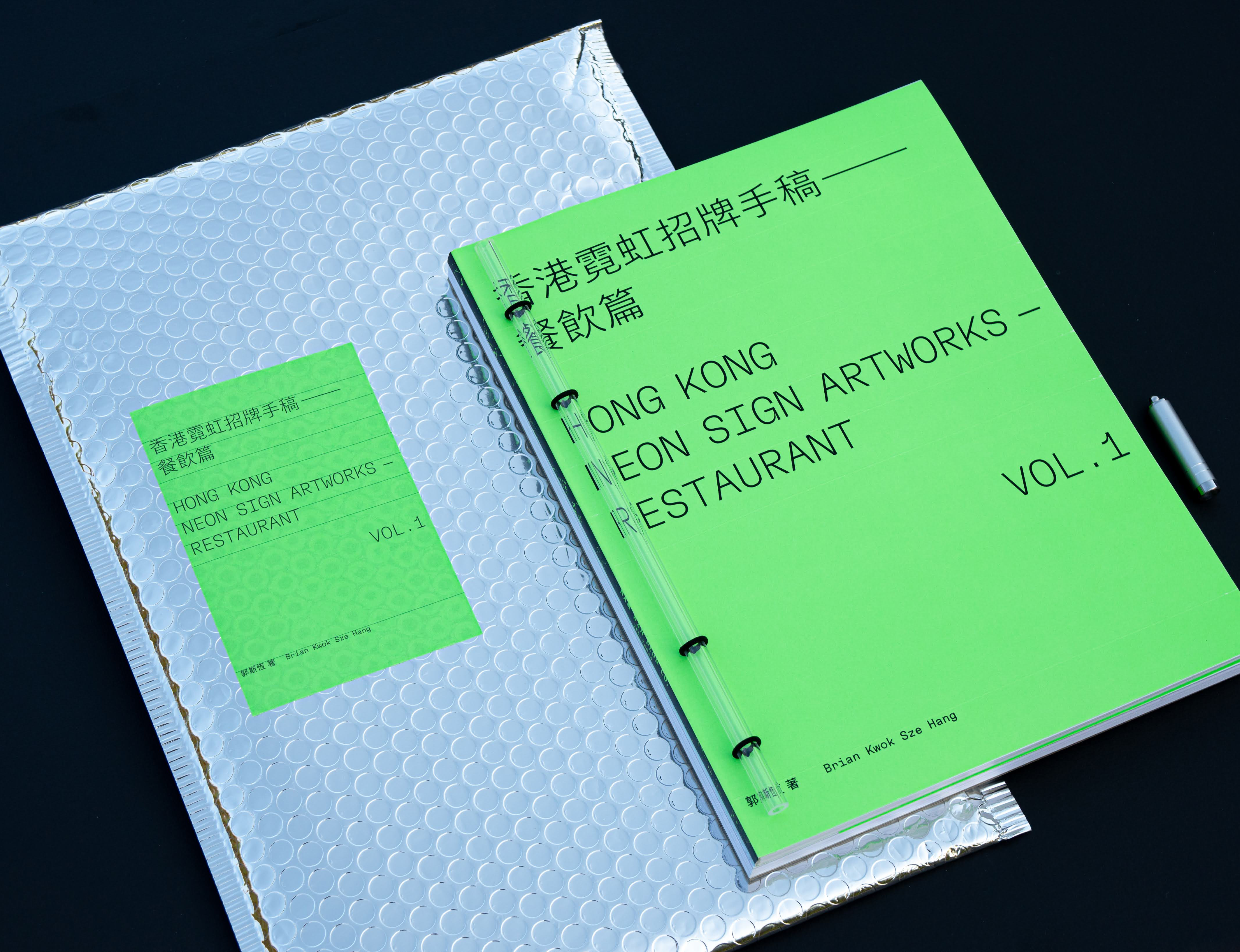
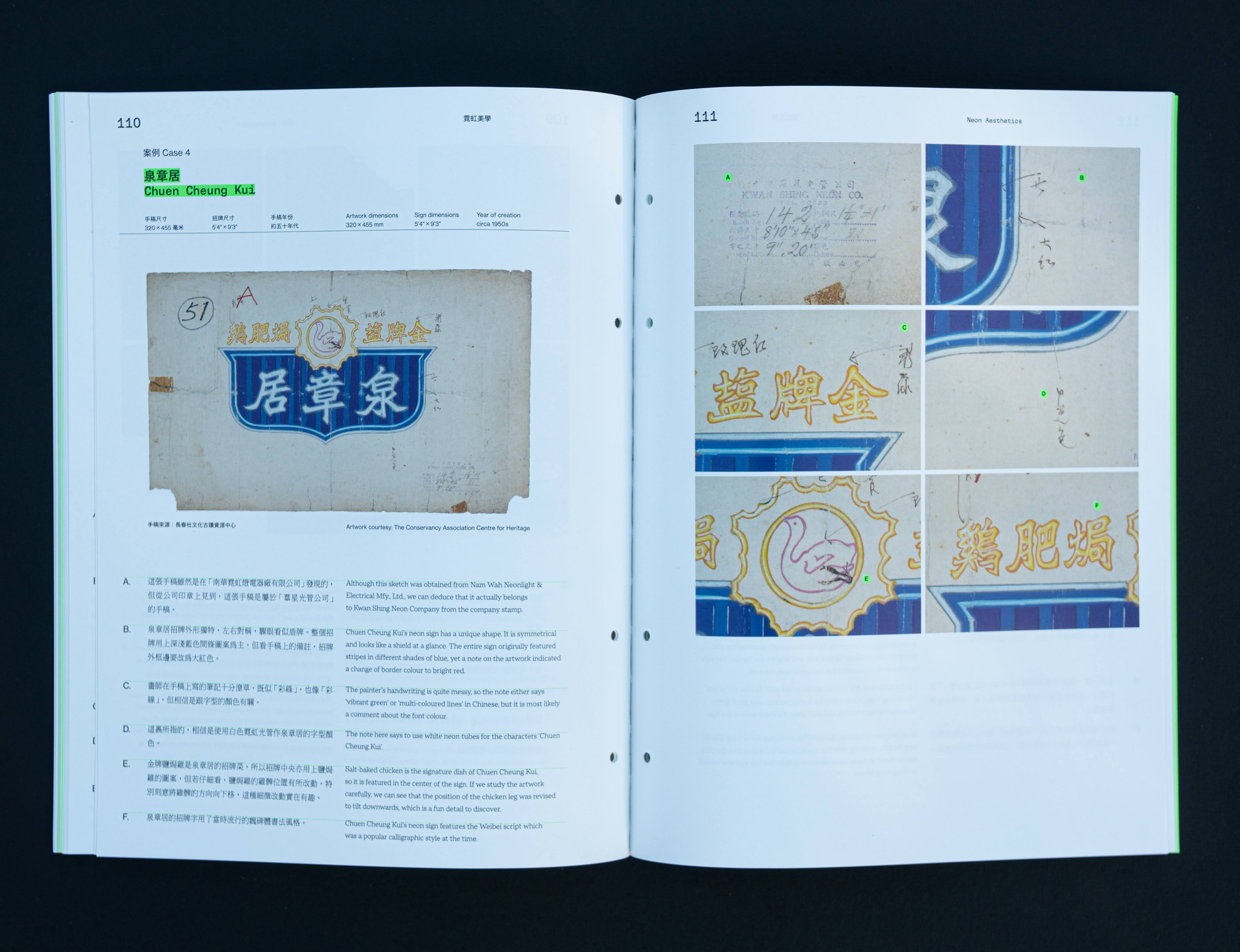
The book is the Lab’s latest design and culture publication. It categorised and analysed 218 restaurant neon sign artworks obtained from Nam Wah Neonlight Mfy., Ltd. to illustrate the history of Hong Kong’s catering industry. The 282-page publication is comprised of two parts — the history of Hong Kong’s neon sign and the catering industry, and the documentation of all 218 pieces of restaurants neon sign artworks. The contents of this book are bilingual (in English and Traditional Chinese), complemented with images and illustrations.
The design of this publication is inspired by the document folders that are often used in archives. A transparent acrylic tube is placed on the cover to mimic the tubes of a neon sign. The publication also comes with a small UV torch that can be used to reveal a glowing printing effect once it is pointed at the pages printed with specialty inks. The combination of both features wish to provoke awareness in the future development of Hong Kong’s neon sign and the conservation of its visual culture.
The publication is solely funded by The Lord Wilson Heritage Trust and is produced on a not-for-sale basis.
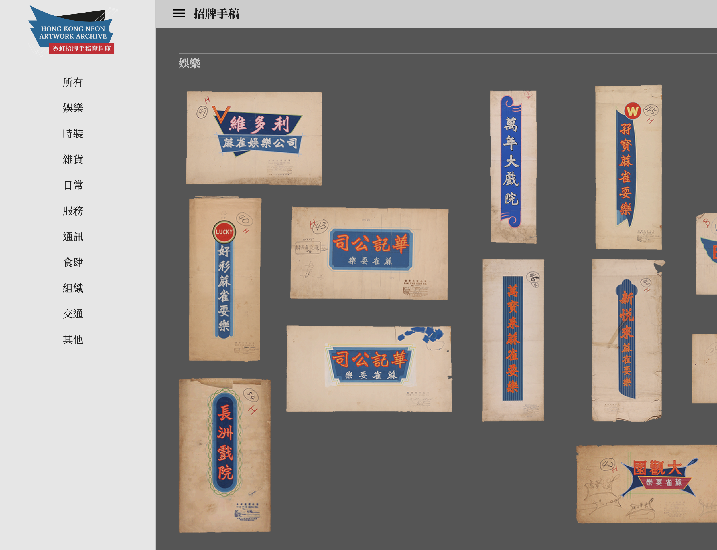
Hong Kong Neon Artwork Archive 霓虹招牌手稿資料庫
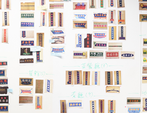
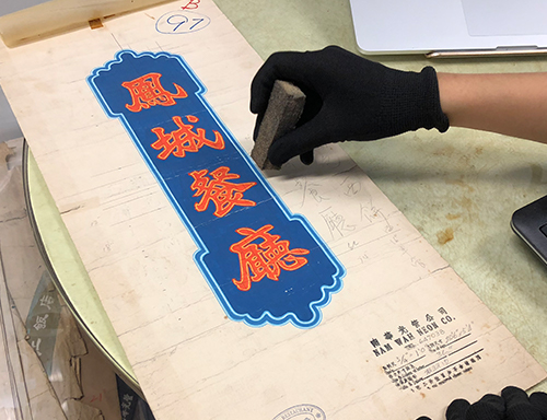
The Hong Kong Neon Artwork Archive is an online catalogue of over 700 neon sign drawings from the 1950s to 1980s. The project is funded by the "Arts go Digital" (藝術D平台) scheme from Hong Kong Arts Development Council. The archive website aims to make the collection of neon sign artworks from Nam Wah Neonlight & Electrical Manufactory Ltd. available to the public’s access for education and research purposes. Detailed records of individual artwork can be found on the website.
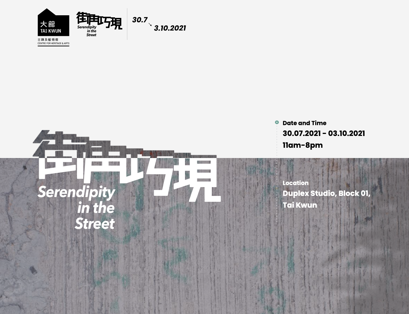
‘Serendipity in the Street 街角巧現’ Exhibition
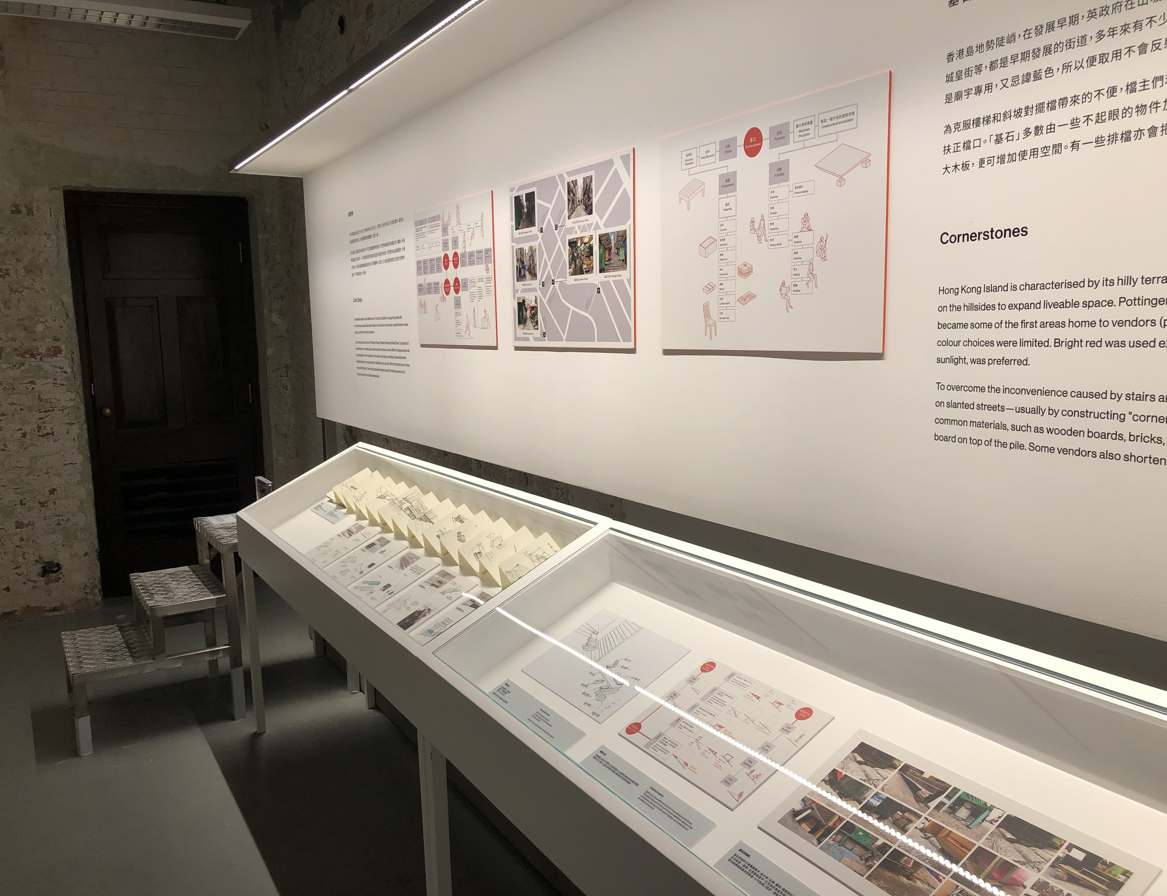
The lab was invited by Tai Kwun, a local centre for heritage and arts, to participate in the research for ‘Serendipity in the Street’ — an exhibition project that observed the Central and Sheung Wan districts of Hong Kong. With reference to the principles and works of Wajiro Kon’s ‘modernology’, the lab’s research team took on the role of urban observers to unveil the hidden wisdom and connections among the neighbours of the districts.
Documentation of the exhibition
《非遺香港——中式長衫的工藝和美學傳承》
The booklet introduces the craftsmanship and the aesthetics of cheongsam, a traditional style of clothing that was very popular in early-20th century Hong Kong. The project is a collaboration between the lab and The Hong Kong Heritage Project with the aim to introduce Hong Kong’s Intangible Cultural Heritage to local young generations. The 74-page booklet illustrates the historical development of the styles of cheongsam, the designs and the process of making a cheongsam, and interviews with cheongsam masters.
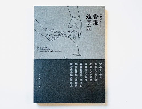
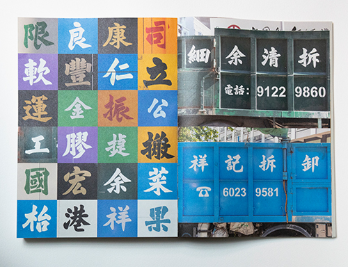
City of Scripts – The Craftsmanship of Vernacular lettering in Hong Kong 《字型城市 —— 香港造字匠》
Hong Kong is a place filled with all kinds of type and lettering. They are the elements that strengthen our bond as a community, enrich our imagination towards places and construct the characters of our neighbourhood. There is a saying in Chinese: ‘Seeing one’s writing is like seeing them in person’. It can also reflect the details and cultivations of our city’s way of life.
In this regard, our research team from Information Design Lab visited our fellow craftsmen to learn about their experience and their lives working with vernacular lettering. Each of their craftsmanship has its own unique features, functions and different pursuits of aesthetics. Consider taking a closer look at them – the untold stories and thoughts shall be revealed behind the characters and figures of these humble craftsmen.
Through this book, we wish to provide more possibilities in understanding our city to those who are interested in lettering and type design as well as street culture.
Neon Signs and Visual Culture: Hong Kong urban life and graphic design history through the lens of neon sign designs
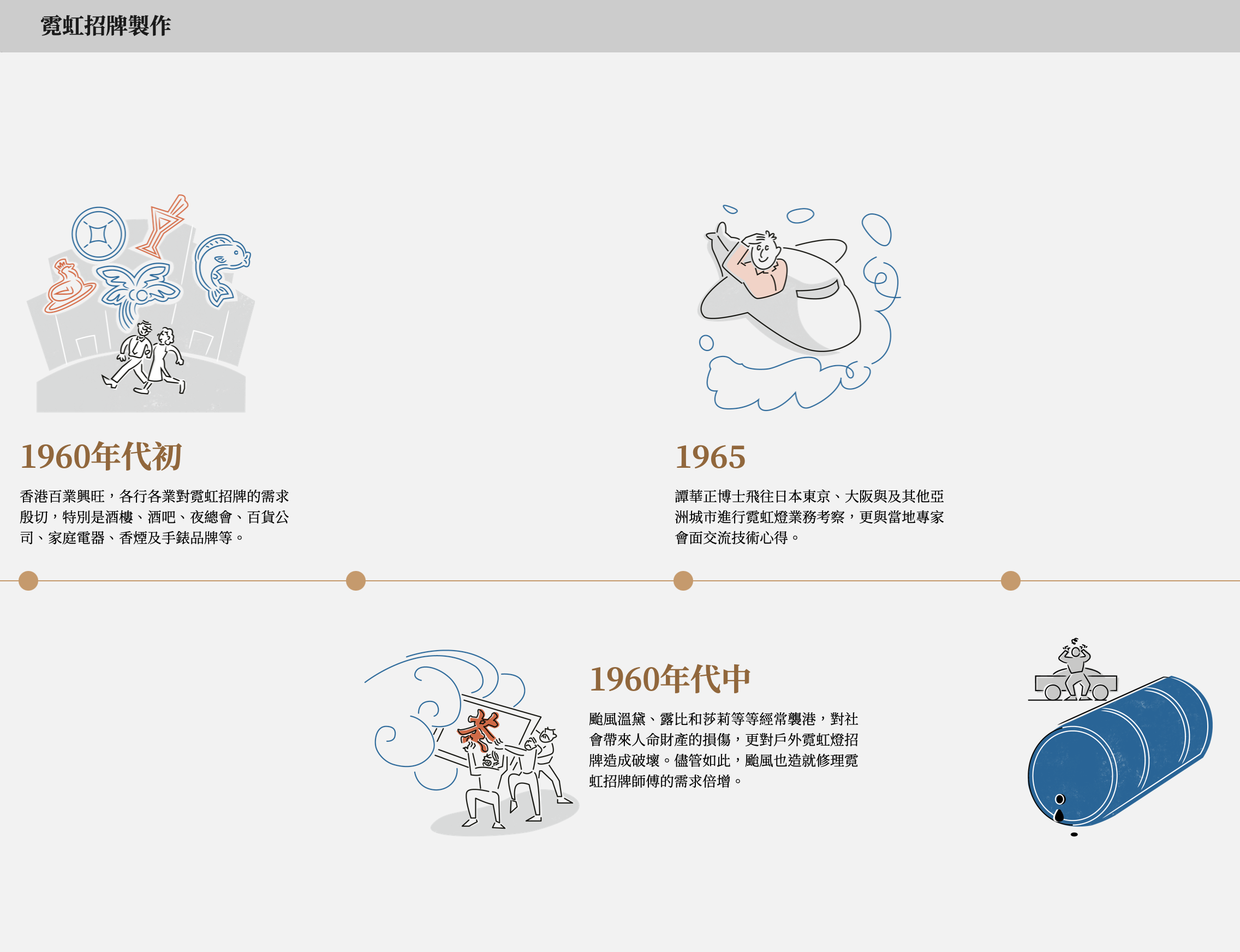
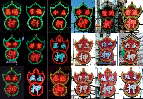
Neon signs are an iconic part of Hong Kong’s visual identity, serving as illuminating records of urban and cultural development. In recent years, the diminishing number of local neon signs calls for an effort in preservation and study.
As each sign embodies narratives specific to a certain time and space, neon signs throughout decades could be seen as significant snapshots of the city’s changing aesthetic, technological and economic landscape. Through the study of neon sign design practices and their relationship with Hong Kong’s history of consumption, the project attempts to understand the styles and designs of neon signs in their cultural, socio-historical and urban contexts.

The archive of neon sign hand-painted artworks
With the donation of several hundred hand-painted artworks from one of Hong Kong’s last remaining neon sign factories, the School of Design has begun a new direction of visual inquiry into Hong Kong’s unique design history, in relation to consumer culture, through the study of these artifacts.
The project will report on design and typographic matters specific to the latter half of the 20th century, and proffer a historical narrative about Hong Kong urban life. Currently the team is working on the archiving and research on a large collection of hand-painted neon sign artworks that were donated by one of the last remaining neon sign factory in Hong Kong.
The ‘Hong Kong Neon Archive 香港霓虹資料庫’ website
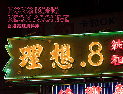
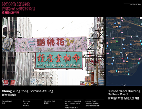
Our continuous documentation of neon signs in Hong Kong since 2015 has accumulated into a small database of over 500 photos, featuring existed and existing neon signs from various perspectives, day and night. The diminishing of neon sign in recent years has caught our attention to the urgency in encouraging discussions and recognition of Hong Kong’s neon sign visual culture. The website aims to introduce our database to public’s access and is designated for research and educational purposes, especially in design and cultural perspectives.
‘Landscape by scripts: Hong Kong 文字のランドスケープ:香港’ Exhibition
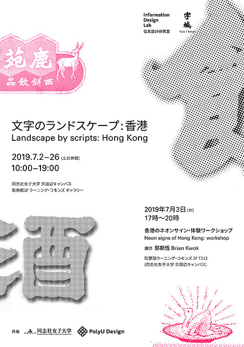
Our first overseas exhibition features physical sign characters collected from old shops of Hong Kong. Exhibits include neon sign artworks, which are carefully selected to reflect the transformation of design in Hong Kong’s neon sign over the decades from 1950s to 1970s. The exhibition shed lights on Japanese’s consumer culture that flourished in the 70s. A workshop about the making of neon signs is held, promoting the craftsmanship of neon tube bending and the construction of a Hanzi characters in neon lights.
‘Landscape by scripts: Hong Kong 文字のランドスケープ’ is an invited exhibition held in Doshisha Women’s Collage of Liberal Arts (同志社女子大学), Kyotanabe Campus, Kyoto, Japan. It is also an extension of the previous City | Script exhibition, introducing three common scripts found in shop signs of Hong Kong, their respective histories and applications observed through neon sign artworks.
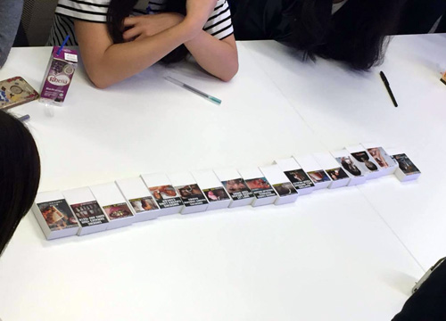
Examining the Effectiveness of Pictorial Health Warnings on the Cigarette Pack in Hong Kong
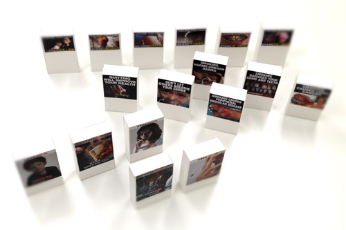
Since 2007, the Hong Kong SAR Government has required all cigarette packs to be printed with pictorial health warnings, as part of an anti-smoking initiative to raise public awareness about tobacco health risks. With the passage of time, the effectiveness of such pictorial measures had gradually diminished, leading to a proposal of enlarged warning size and new images, in part following example from the World Health Organisation’s (WHO) guidelines. Different parties, however, have raised concern over the perceived impact of the proposed solutions.
The Information Design Lab notes that past approaches with anti-smoking campaigns in Hong Kong had involved very little, if any, in-depth analysis over the factor of fear appeal and visual language related to effective health communication, which would contribute to the decision to quit smoking. This research project intends to fill this gap, by 1) understanding different stakeholders’ views on pictorial warnings on cigarette packs, 2) carrying out an assessment of fear appeal present in local cigarette health warnings in comparison with other countries, 3) examining the effectiveness of such warnings on cigarette packs, both local and overseas, and 4) understanding the correlation between warning display size and the desired emotional impact.
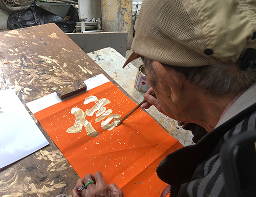
Recognising local type craftsmen and the craftsmanship of type designers and masters
Hong Kong’s cityscape was known for its cascading shop signs that brought pedestrians huge visual impacts, marking their impression towards Hong Kong. Yet behind these iconic scenes composed by Chinese characters and scripts, are local craftsmen and designers, whose work of arts transcend written words into what is known as one of the identities of Hong Kong nowadays. This project aims to recognise and identify vernacular and implicit type design practices and craftsmanship in Hong Kong.
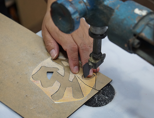
Research and study on Hong Kong's shop sign, Chinese calligraphy and streetscape
The project studies the design and Chinese calligraphy used in local shop signs. The lab actively collects and preserves shop sign characters of shops that were recently closed down or were demolished due to the tightening sign regulations for research and educational purposes.
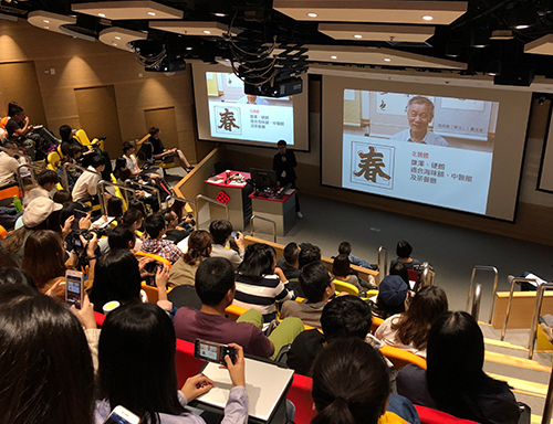
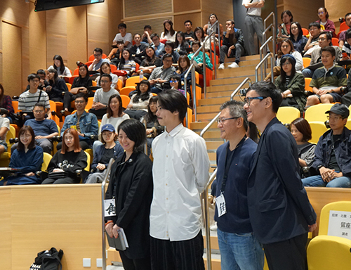
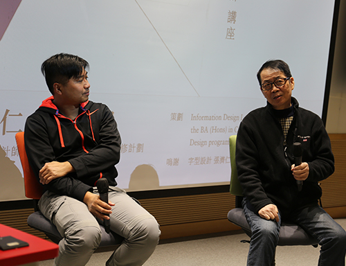
The 'Streetscape pictured by Shop Sign, Beiwei and characters' Seminar〈招牌.北魏.文字風景〉講座 was held in November 2018 at the The Hong Kong Polytechnic University was co-organised by the Information Design Lab and Who Cares?. It explored the everyday-life encounters and observations made in the use Chinese type as a crucial element to Hong Kong’s cityscape. Speakers includes Brian Kwok (on ‘The Observation on Hong Kong Streets’ Neon Sign'), Adonian Chan and Ire Tsui (on ‘The Journey and Discovery to Hong Kong Beiwei Zansyu’) and Sammy Or (on ‘The Type Sceneries in the Mainland, Taiwan and Hong Kong’).
More about the seminar can be found at:
The Facebook event page
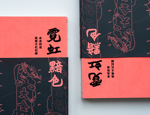
Fading of Hong Kong neon lights – The archive of Hong Kong visual culture《霓虹黯色——香港街道視覺文化記錄》
With strict policies imposed on sign regulations by the Buildings Department since 2010, the neon sign industry in Hong Kong has shrunk from its unprecedented splendour with hundreds of practitioners to only a dozen at present day.
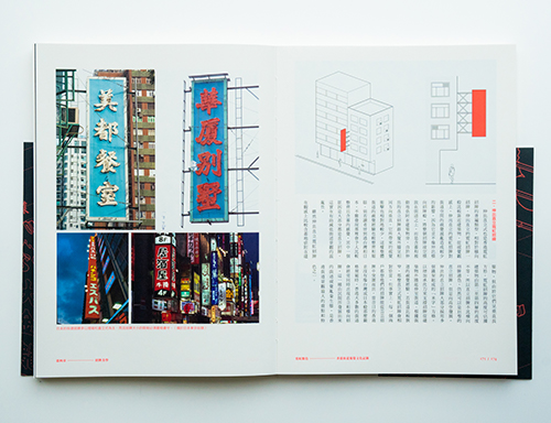
‘Fading of Hong Kong neon lights – The archive of Hong Kong visual culture’ aims to document and recognise the craftsmanship of neon lights and study the visual culture and design that revolves around the craft under the context of Hong Kong. Over 500 photos of existed and existing neon signs from Tsim Sha Tsui, Jordan, Yau Ma Tei, Mong Kok, Prince Edward and other districts were photo-documented since 2015.
The book takes on a historical, socio-cultural and contextual study of Hong Kong signs, as well as the exploration of the inter-related components of neon signs: its unique visual aesthetics and design, the craftsmanship and their relations to how our consumer culture and the Hong Kong streetscape are constructed.
Funded and supported by the Arts Development Council (ADC) in 2017, the book was published and distributed to the public in the summer of 2018 by Joint Publishing Ltd. The book has drawn a good amount of attention and social responses in media and news coverages from HK01, Oriental Daily, Apple Daily, Ming Pao and The Guardians.
Currently the book is in the process of translation for a forthcoming English edition.
Our goal to preserve Hong Kong neon sign continues:
霓虹黯色 Facebook and 霓虹黯色 Instagram
MaD Asia 2019 Excursion: hoeng1 gong2 ngai4 hung4
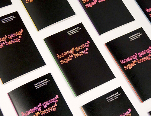
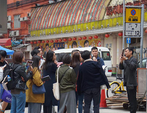
Hong Kong won its name as the ‘Pearl of the Orient’ for its spectacular night view. However, with the implementation of a new law for unauthorised signboards by the Buildings Department, many neon signs have been taken down in recent years. The new light tour aimed to introduce participants the socio-cultural and historical significance of these urban objects, and how they play a role in defining the sense of locality by carrying both textual and visual information.
In collaboration with MaD Asia in their 2019 excursion programme, we travelled through streets and alleys of the Yau Tsim Mong district to appreciate the designs and craftsmanship of neon signs.
Designing The Spectacle—Pre-Digital Graphic Design Practices
〈設計奇觀——香港正稿時代〉
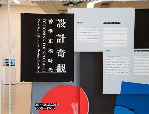
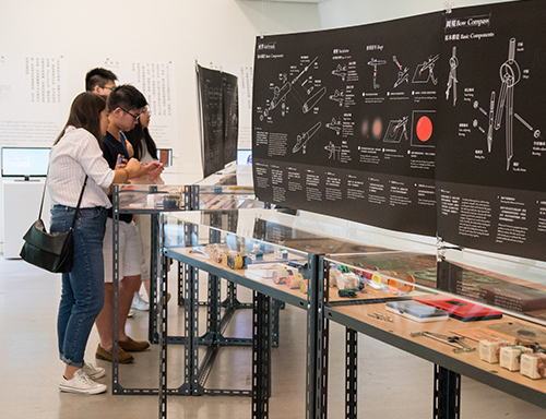
‘Designing the Spectacle’ is an exhibition that highlighted the craft supporting Hong Kong’s spectacle of signs and advertisements as it developed in the second half of the twentieth century. Sketching the production history of graphic design in the decades before the arrival of the computer, we showcased design sketches that preceded the spectacle and the drafting tools that contributed to the history of Hong Kong graphic design.
More about the exhibition, seminar and workship can be found at:
City|Script 字城 Facebook
City|Script 字城
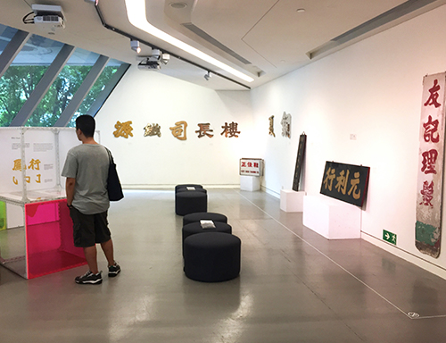
‘City | Script’ is an exhibition about Chinese calligraphic scripts used in shop and restaurant signs. We showcased physical shop signs, photos, and historical neon sign artworks, exploring the history and visual features of three Chinese calligraphic scripts commonly found in Hong Kong.
‘City | Script’ is also a unit for events related to 'city' and 'scripts' to be host under this title. One of our recent event is the 'Streetscape pictured by Shop Sign, Beiwei and characters' Seminar〈招牌.北魏.文字風景〉講座
For updates, please visit: City|Script 字城 Facebook
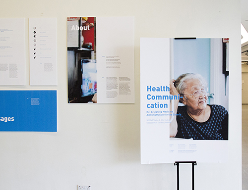
Health Communication: Re-designing Medicine Administration for the Elderly
Today, the ageing population is subject of discussion and inquiry across the world, also in Hong Kong. The Census and Statistics Department has predicted that, in 2039, Hong Kong will be home to an estimated 2.5 million people of 65 years or older. This figure suggests that there are challenges ahead and an important factor will be an increase in medication administration.
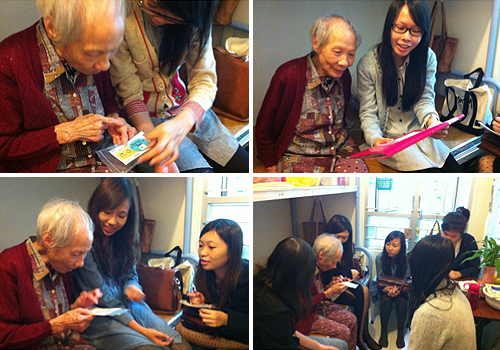
It has been found that elderly people in Hong Kong, especially those who live alone, easily make mistakes when administering medicines. Without doctors or friends on hand to help, these older patients have to struggle with the small print and poor information design that is often found on medicine labels.
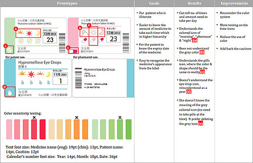
The project studies current Hospital Authority’s medicine labels, which most of Hong Kong’s elderly are familiar with, in terms of their typographic design, physical form and adminstration methods. Through user studies and observation, ideas that question and improve the existing experience of medication administration among the elderly were experimented with design prototypes and rounds of user testing.

Exploring the vernacular design knowledge in the visual aesthetics and craftsmanship of neon signs
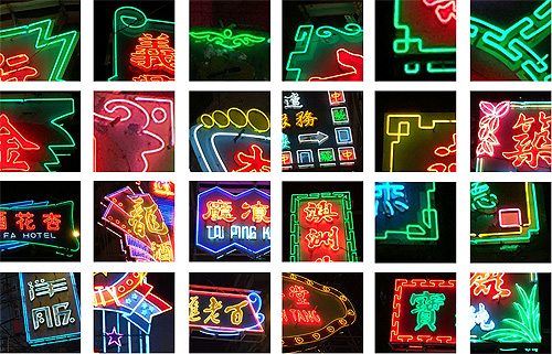
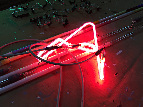
The project aims to build, in light of their imminent disappearance, a database of currently still existing Hong Kong neon signs and study the ways in which written and graphic language is used in neon signs as they are presented in our urban landscape today. It also intends to relate the visual form to the technical specificities of the craft of neon sign making.
This research project takes on perspectives of historiography, typography and visual analysis, in order to examine mainly two areas of interest in neon signs – their unique visual aesthetics and design (external audit), and craftsmanship (internal tacit knowledge). This study is part of an open source archive of urban signage - as an analytical tool as well as a historical record. The historiography approach allows researchers to trace the origin of Hong Kong neon signs from the aspects of communication design, typography and visual culture. Indeed, the emergence of local neon signs not only truly echoed economic growth and consumer culture in Hong Kong since the 1970s, but also reflected the development of visual culture, typography and graphic design in the city.
Designing Accessibility and Usable Tabular for Nutrition Labels
Obesity, being one of the most significant public health issues in modern society, is largely related to the consumption of excessive fat and sugar in everyday diet. Many other forms of health problems can also be traced to the excessive intake of certain ingredients in processed foods. Nutrition labels are therefore viewed as important tools to convey health information of concern to consumers, aiding them in making better food choices in accordance with their personal health needs.
In Hong Kong, a unified and coherent information design system for nutrition labels has yet to be developed. Labels on the market vary in design and quality, rendering it difficult for consumers to understand and compare product ingredients. The aim of this research project is, therefore, to develop a new design system for nutrition labels or tables, generated from a series of user tests and in-depth interviews, to be applied across all food products. This system should be user-friendly, highly accessible, comprehensible and usable for the general public.
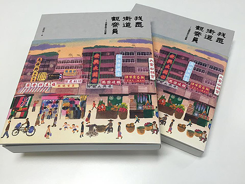
I am a Street Ethnologist: Street Culture in Fa Yuen Street 《我是街道觀察員──花園街的文化地景》
Fa Yuen Street is an open and public market located at the edge of the Mong Kok District. Besides it being a place of commerce, it is also a well-known local landmark where cultural identity is shaped and a sense of belonging is formed.
The street is a platform, as argued by scholars (e.g. Jacobs 1961; Mumford 1998) , where a person’s communication takes place. In turn, this helps foster a local community of diversity and build intimate relationships among people. Today, Fa Yuen Street has gradually turned into a packed space accommodating about 233 hawker stalls and 139 street-level shops. Many interconnected factors and interactions between different stakeholders (such as hawkers, residents, shop owners, etc.) have contributed, together, to the creation of a tightly knit community and years-long close relationships.
The book “I am a Street Ethnologist: Street Culture in Fa Yuen Street” explores a range of inter-related perspectives on human interactions in the street and investigates how they have constructed a neighbourhood that exists through tightly networked social bonds in a distinctly local context. It also presents various spatial tactics reflecting Hong Kong’s street culture and vernacular knowledge. The book can be taken as a useful reference in light of urban redevelopment and street culture preservation in Hong Kong, in the near future.
Funded and supported by the Arts Development Council (ADC) in 2013, the book was published and distributed to the public during the summer of 2016. Joint Publishing and Brian Kwok received the Distinguished Publishing Award for the publication at the 28th Hong Kong Print Awards 2016.

Wayshowing Project for Jockey Club Innovation Tower
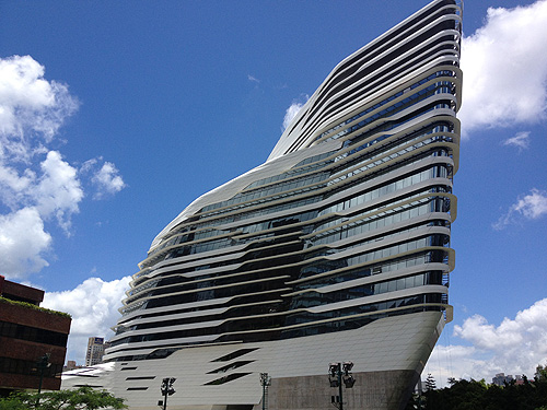
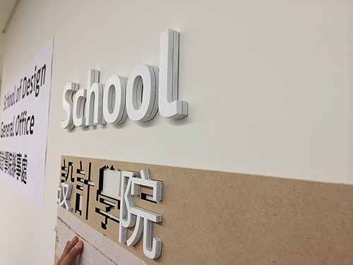
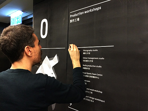
The Jockey Club Innovation Tower at PolyU was designed by world-renowned architect Zaha Hadid, and completed in mid-2013. The Information Design Lab was involved in the design of the building’s wayshowing system, engaging with different parties and stakeholders and conducting a series of user-tests to present a better user-centered signage system.
A wayshowing system is a communication system integral to an architectural space. It is a coherent set of related communication artifacts, such as signs, maps, symbols, messages, environmental graphics, interfaces etc., which aims to help visitors in the navigation of space and support them in accomplishing what they have set out to do within the space. The goal of wayshowing design is to create an experience that is effective, effortless as well as enriching. A wayshowing system also has the potential to appeal to the users’ emotions, giving the building a ‘sense of place’ and the institution a tangible identity.
Designing effective medicine information for senior citizens in Hong Kong
According to a report published by the Census and Statistics Department in 2009, Hong Kong people at the age group of 65 and over are estimated to be around 2.5 million by 2039. The figure explicitly shows that there are urgent challenges ahead for a rapidly ageing population, and the consumption of medicine will increase.
Mistakes in medicine intake are common among older patients in Hong Kong. Some may lead to fatalities, particularly for older patients who live alone. These elderly patients have to struggle with the small print and poor information design often found on medicine labels. This project is a response to the imminent need for improving medicine labels in the public healthcare system in Hong Kong. Through cycles of prototype generation, user testing and participatory research, the project aims to decrease the number of errors related to medicine intake and to enhance active ageing in the local community through effective information design.
Brian Kwok presented the initial findings on this project at the Information Design Conference in Greenwich, UK in April 2012.
View presentation slides on SlideShare
Wayfinding and spatial representation in Hong Kong
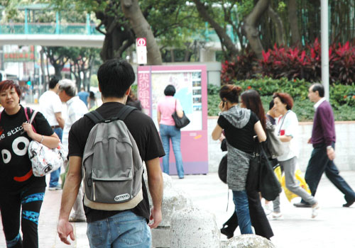
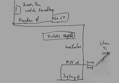
Hong Kong has a population of 7 million. Covering an area of 1,104 square km, its density is amongst the highest in the world. With extensive transportation networks made up of mostly railways and buses, it serves an average of 7.57 million passenger trips per day. It is not difficult to imagine the complexity in both wayfinding and wayshowing in this compact yet dense city. How do people develop spatial knowledge amidst this complexity? Through what means do people accumulate spatial knowledge so that they can make sense of the city and effectively traverse through it?
This project investigates how people navigate form mental maps in three major areas of Hong Kong (Central and Western, Wan Chai and Yau Tsim Mong districts), and how these relate to the design of spatial representations such as maps and wayshowing systems. The research comprises of three aspects, examining existing wayshowing tools, sites and environmental clues as well as people’s wayfinding behaviours.
Tourism information design
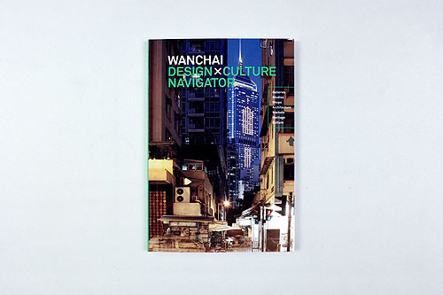
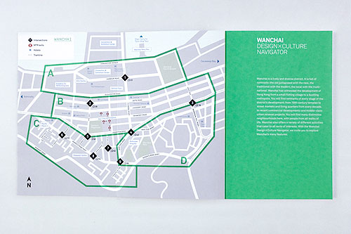
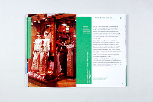
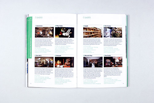
This practice-led research project involves the research, conceptualization and production of a series of guidebooks titled Design × Culture Navigator for various areas of Hong Kong. Adopting a user-centered approach, the project aims to explore what makes tourist information easily understandable through a series of design investigations. Student interns from the Communication Design programme have participated in the project. The first title on Wanchai was published in December 2010; the second in the series on Tsim Sha Tsui and the surrounding areas was published in November 2011. In addition to the production of commercialized publications, this project also aims to generate new knowledge on tourism information design such as models, workflow, methodologies and principles for the researching, writing, designing and producing tourist guidebooks. As a collaborator, the Hong Kong Design Centre provides partial funding and support for this project.
Both the Wanchai and Tsimshatsui Design × Culture Navigator are now on sale at major bookstores in Hong Kong.
- Wanchai – ISBN 978-988-19341-6-4
- Tsimshatsui & Vicinity – ISBN 978-398-18341-0-2 (distributed by AsiaOne Product and Publishing Limited)
The Wanchai Design × Culture Navigator has won a merit recognition in the 2011 Design for Asia Awards organized by the Hong Kong Design Centre.
Bilingual typography: Hong Kong case studies
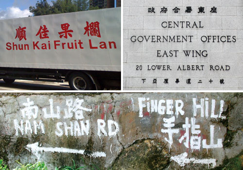
Bilingual typography in Hong Kong has a long history but there has not been much analysis on its effectiveness or significance. This project aims to find out where the issues lie in Chinese–English bilingual typography and what makes it effective. Three types of bilingual typography is being examined: 1. Where two languages/scripts appear as equivalents to each other in terms of meaning; 2. Where one language/script is embedded into another below the clause level, termed as ‘code-mixing’ in linguistics; and 3. Where one language interweaves into another at clause level or above, termed as ‘code-switching’.
Keith Tam delivered a keynote presentation on this project at Same/difference: multilingual typography symposium in August 2011.
View presentation slides on SlideShare
View presentation YouTube video
Same/difference: multilingual typography symposium 2011
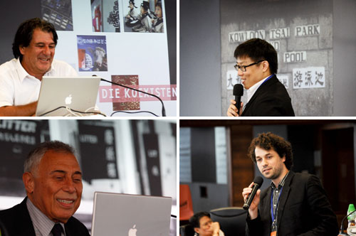
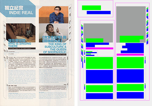
An international symposium on multilingual typography titled ‘Same/difference’ was held at the Hong Kong Polytechnic University in August 2011, co-organized by the Information Design Lab and the Design2Context Design Research Institute at the Zurich University of the Arts. Keith Tam, former leader of the IDL delivered a keynote presentation titled ‘Bilingual typography: Hong Kong case studies’. Other speakers include Ruedi Baur, Henry Steiner, Wang Xu, Esther Liu, Roman Wilhelm, Zhang Hua, Sammy Or and Mariko Takagi.
